Most meetings ask people to listen, absorb information, and remember the most important parts long after the event is over. The problem is that spoken content alone often fades quickly, especially when the ideas are complex, technical, or packed into a short amount of time. We use visual storytelling to help organizations turn those moments into something people can actually follow, connect with, and remember. When a message becomes visible in real time or through a commissioned visual, it stops feeling temporary and starts feeling usable.
Visual storytelling works because people process images differently than they process spoken or text-heavy information. A visual can show relationships, priorities, and patterns at a glance in a way that long explanations often cannot. That matters in meetings and workshops, where people are trying to take in ideas while also deciding what those ideas mean for their work. When information is made visible, people usually spend less energy trying to decode it and more energy engaging with it.
Retention improves when people have more than one way to understand the message. If an audience only hears a series of talking points, they have to work much harder to organize those ideas in their minds. When those same points are paired with icons, phrases, connections, and visual hierarchy, the message becomes easier to recall later. That is one reason visual storytelling is so valuable in learning environments, strategic planning sessions, and presentations where understanding needs to last beyond the room. People remember what they can see much more easily than what they are asked to hold onto through sound alone.
We also see retention improve because visuals create a shared reference point. Instead of leaving each person to interpret the presentation alone, the group can look at the same image and work from a common understanding. That helps reduce confusion and gives people something tangible to revisit after the event ends. A recorded visual can continue working as a handout, discussion guide, or internal communication asset long after the session is over. That kind of afterlife is one of the strongest practical benefits of visual storytelling.
People do not act on information only because it is accurate. They act when the message feels clear, relevant, and meaningful enough to move them. Visual storytelling helps create that bridge because it brings emotion and understanding together instead of treating them as separate parts of communication. A good visual does not just explain what happened in a meeting. It helps people feel the stakes, the momentum, and the shared purpose behind the conversation.
That emotional connection matters in organizations because alignment rarely comes from facts alone. Teams may hear the same strategic plan, keynote, or training session and still walk away with very different interpretations. When the message is captured visually, it becomes easier to see how the pieces connect and why they matter. A visual can highlight tension, possibility, progress, and collective goals without turning the message into something overly complicated. That helps people connect not only with the content, but also with each other.
We find that action becomes more likely when people leave with a message they can actually revisit and talk about. A visual story keeps the conversation alive because it gives teams language, images, and structure they can return to when they make decisions later. It also makes the original presentation feel less like a one-time event and more like the beginning of a larger process. That is especially useful for leaders, trainers, and facilitators who want their sessions to influence behavior after the meeting ends. Visual storytelling supports that kind of lasting impact because it turns insight into something people can carry forward.
One of the most powerful parts of visual storytelling is real time scribing. When ideas are being drawn live as people speak, the room changes almost immediately. Audiences become more attentive because they can see the conversation take shape in front of them. Presenters become easier to follow because their ideas are no longer moving past people in sound alone. What might have felt like a standard presentation starts to feel more like a live conversation with visible momentum.
Real time capture also creates a stronger sense of participation. People can see their ideas reflected, connected, and elevated as the visual develops. That makes workshops and meetings feel more collaborative because contributions do not disappear the moment someone stops talking. Instead, they become part of a larger visual map that everyone can see and respond to. This is one of the reasons visual storytelling works so well in strategic planning sessions, keynotes, community engagement forums, and collaborative workshops.
We believe this live element is what helps many organizations move from passive attendance to active engagement. A scribed visual creates energy in the room because people can literally watch meaning being built in real time. That creates curiosity, sharpens focus, and helps participants stay connected to the bigger picture as the discussion evolves. It also gives facilitators and presenters a better chance of holding attention without relying on slide-heavy delivery. When people can see their thinking unfold, the meeting feels less static and more alive.
Visual metaphors are one of the most practical tools in visual storytelling because they help people understand abstract ideas quickly. Many presentations deal with concepts like growth, alignment, innovation, systems thinking, change, or leadership. Those ideas can become vague when they stay trapped in corporate language or text-heavy slides. A well-chosen image gives the audience a way to understand the concept almost instantly. That matters because clarity often begins when people can picture the idea, not just define it.
A metaphor does more than make the message look interesting. It simplifies without flattening the idea into something too basic. A pathway, bridge, ecosystem, thread, or map can help people understand relationships and movement in a way that plain language often struggles to do on its own. That is especially useful in workshops and presentations where the goal is not simply to explain a concept, but to help people use it. Visual storytelling gives those concepts shape, and shape makes the message easier to work with.
Frame The Message Ink is especially well positioned to do that kind of work because the site centers on graphic recording, commissioned visuals, sketch videos, and facilitation support that help ideas become visible and memorable. The business is led by Taryl Hansen, who brings more than 25 years in education and adult professional development to this work, and that background shows in the way the services are framed around learning, engagement, and understanding. We do not see the service as decoration added after the fact. We see it as a communication tool that helps audiences make sense of complex ideas in live, virtual, and commissioned formats. That is a big reason organizations looking for visual storytelling support in Phoenix and beyond would benefit from contacting Frame The Message Ink.
One of the strongest reasons to invest in visual storytelling is that the value does not stop when the meeting ends. A recorded visual can be reused in follow-up communication, training materials, recap documents, internal presentations, and leadership conversations. That means the message has a life beyond the room and can keep helping teams remember what mattered most. Instead of fading into meeting notes that nobody reopens, the content stays visible and usable. That alone makes the original event more valuable.
We also think organizations benefit because visual work supports both clarity and continuity. A single meeting may only last an hour, but the decisions, alignment, and communication that follow can stretch over weeks or months. When the original conversation is captured visually, teams have something concrete to revisit as they keep moving. That helps reduce drift and keeps people connected to the purpose of the work. For leaders, trainers, and presenters, that is often the difference between a session that sounded good in the moment and one that actually changes what happens next.
Visual storytelling helps meetings, workshops, and presentations make a lasting impact because it turns ideas into something people can see, remember, and use. It strengthens retention, creates emotional connection, makes real time conversations more engaging, and uses visual metaphors to simplify what might otherwise feel abstract or forgettable. Frame The Message Ink offers that kind of support through live and virtual graphic recording, commissioned visuals, and sketch videos designed to help organizations communicate with more clarity and staying power. If the goal is to make your next event more memorable and more useful after it ends, we encourage you to contact Frame The Message Ink and start the conversation.
My connection to TEDx started in 2016 when I gave my first TEDx talk, Mastering the HeART of Communication. That experience opened a new door for me as a speaker, a listener, and eventually as a visual scribe who wanted to keep supporting strong ideas after the applause ended. Not long after that, I became part of a student-led TEDx community built around curiosity, leadership, and thoughtful storytelling. Ten years later, I still care deeply about the TED world because I have seen how one event, one speaker, or one image can stay with people long after they leave the room.
When I show up to a TEDx event as a visual scribe, I am not only drawing what I hear. I am listening for the heart of a speaker’s message, the thread that holds the talk together, and the moments that will stick with an audience after the event is over. I pay attention to key phrases, emotional turns, strong metaphors, and the structure of the story. Then I turn those ideas into visuals that help people remember what mattered.
That process looks fast from the outside, but it starts long before the marker hits the page. I am constantly sorting information, deciding what supports understanding, and thinking about how to make a complex message feel simple without making it shallow. A visual scribe has to balance speed, clarity, and emotion all at once. That challenge is exactly why I love this work and why TEDx has been such a meaningful place to do it.
For me, live graphic recording is one of the most honest forms of listening. I have to stay fully present, trust my instincts, and respond to ideas as they unfold in real time. That is especially exciting in a TEDx environment because every talk is built around an idea worth spreading, and I get to help that idea take on another form. The visual becomes a second doorway into the speaker’s message, which can be incredibly powerful for the audience.
Frame The Message Ink grew out of my belief that ideas deserve more than one way to be heard. Spoken language can move people in the moment, but visuals help ideas stay visible, easier to revisit, and more likely to travel beyond the room. That is one reason I have stayed involved for so many years. I wanted to keep a good thing going and continue giving back to the TED community in a way that felt true to my work.
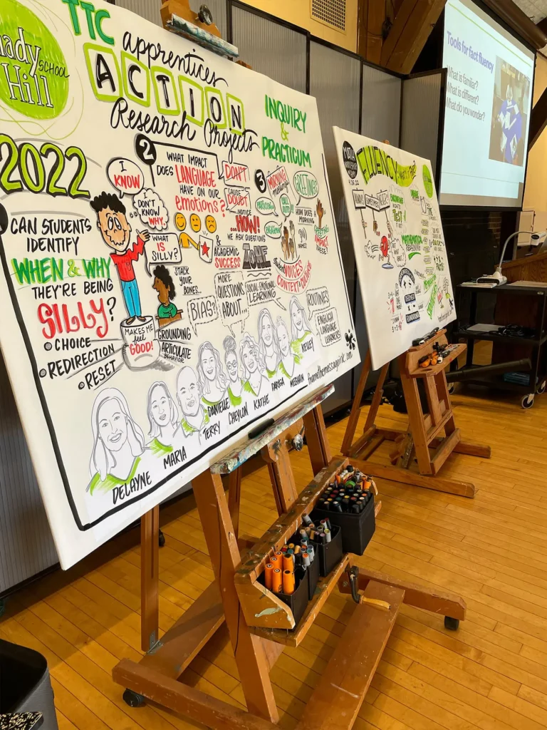
I have drawn live at TEDxTucson and then almost every year for nine years within this student-led TEDx tradition in Phoenix. Over time, I have watched speakers, student organizers, and audience members all bring their own energy to the experience. What I love most is that the visual work does not end when the event ends. It becomes a way to help speakers share their ideas more broadly and help viewers connect with those talks after the stage lights are off.
That bigger purpose is part of how I think about Frame The Message Ink as a business. My work is not about decoration for decoration’s sake. It is about turning ideas into visual stories that support understanding, retention, and engagement in ways people can carry into the future. The site reflects that clearly through live and virtual graphic recording, commissioned illustrations, and sketch videos, all built around helping messages become memorable.
One of the things I hope readers take from this story is that graphic recording is not only for TEDx. If you have ever watched a talk and thought, I wish I could bring that kind of energy and clarity into my own conference, workshop, classroom, board retreat, strategic planning session, or keynote event, you absolutely can. A visual scribe can help people follow complex information more easily and stay connected to the bigger message. That is true in education, nonprofit work, business settings, leadership training, healthcare, community engagement, and so many other spaces.
People are often curious about how this kind of live notetaking works outside a speaker event. The answer is that the purpose stays the same even when the format changes. I listen for key ideas, capture the flow of the conversation, and create a visual that helps participants understand and remember what happened. Whether the setting is a workshop, a multi-day retreat, or a presentation, the visual gives people something they can return to instead of leaving with only scattered notes or fading impressions.
I have found that many leaders and planners do not realize this industry exists until they see it in action. That is why I love sharing the process and opening the door a little wider. Once people understand what a visual scribe does, they often start imagining how it could support their own teams, events, or organizations. That curiosity is exactly what I hope this article sparks, because good ideas are not limited to one stage or one brand.
I also hope this article nudges more people to attend a TEDx event in their own community. Watching TED and TEDx talks online is valuable, but being in the room is a different experience. You feel the attention, the anticipation, the nerves, and the shared energy of people listening together for something that might challenge or inspire them. That sense of community is one of the reasons TEDx continues to matter.
What has always stood out to me about this Phoenix-based student-led TEDx event is how much ownership the students bring to it. It does not feel like a copy of something bigger. It feels like a living event shaped by people who care about ideas, leadership, and doing meaningful work together. That spirit is part of what made this Legacy Year feel important, because it marked ten years of students and supporters building something that keeps evolving.
I would love to see more people attend a TEDx event, whether it is in their hometown or at next spring’s student-led TEDx event in Phoenix in 2027. These events give people a chance to experience ideas in a more human way and see what happens when a community builds something thoughtful together. They also remind us that great talks do not only come from famous names or major stages. Sometimes the most memorable ideas come from local speakers and local rooms full of people who care.
Another big hope I have for this article is simple. I hope people watch more TED and TEDx videos and share them. A talk does not stop working after the event ends, and every additional view helps a speaker’s message move farther than it could have on its own. That matters to me because I know how much time, courage, and heart speakers put into shaping a talk that may only last a few minutes on stage.
I especially hope people seek out and share talks connected to this past legacy year and the speakers who made it meaningful. A talk can keep opening doors long after it is recorded if people are willing to send it to a friend, mention it in a class, use it in a meeting, or post it somewhere others will find it. That is one of the reasons I stay involved. I want to support speakers not only while they are presenting, but also while their ideas continue finding new audiences.
For me, this ten-year reflection is really about staying connected to a community built around thoughtful communication. TEDx gave me a place to speak, listen, draw, and keep learning from other people’s ideas. Frame The Message Ink gave me a way to contribute something real to that experience through visuals that help ideas last longer and travel farther. If this story makes you want to watch a talk, attend a TEDx event, learn more about the history of TEDx, or explore how a visual scribe could support your own work, then it has done exactly what I hoped it would do.
I love the chance to draw alongside educators who want their work with students to feel practical, not abstract, especially when time runs short, and the urgency to meet the needs of students is real
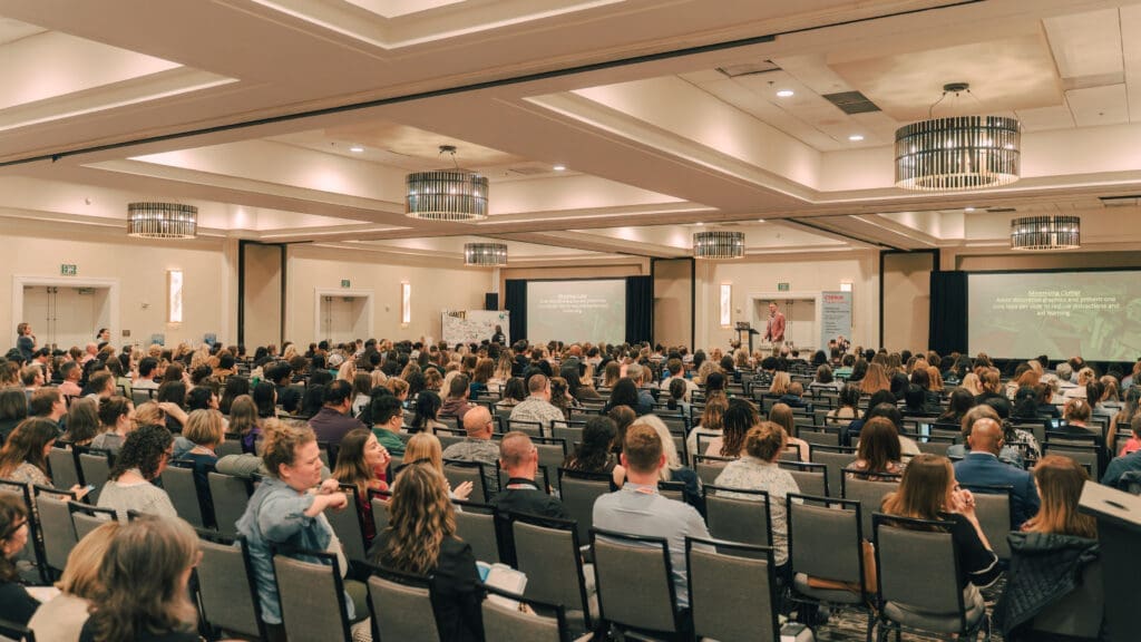
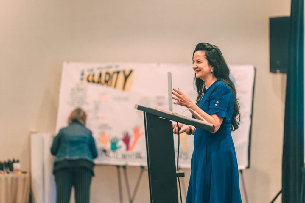
On February 23-25, 2026, over 600 educators gathered for Corwin’s 2026 Annual Teacher Clarity Playbook Conference in San Diego, California. Throughout the conference, I illustrated keynotes for Doug Fisher, Nancy Frey, Valentina Gonzalez, John Almarode, and Dominique Smith, leaders in the field of education.
I decided to draw LIVE at the 2026 Annual Teacher Clarity Playbook Conference because the conference focus deserves a learning format that matches its message. Teacher clarity asks teachers to be clear, so the ideas shared by experts should also feel clear in the moment. Many educators attend conferences to learn more, but multi-day learning can overload working memory and create cognitive fatigue. Even great sessions can blur together when your brain stores too many new concepts without enough structure. Live graphic recording creates that structure as the learning happens, so your brain has anchors to return to later. My goal was for every attendee to leave with ideas they could use on Monday, not just notes they forget on Friday.
Doug Fisher and Nancy Frey’s widely published work on Teacher Clarity sits at the center of strong instruction because students learn more when goals, outcomes, and evidence are clear. Keynote ideas were captured in real time so listeners could see connections across sessions instead of holding everything in separate buckets. In the live illustrations, you will see goals, outcomes, success criteria, and evidence appear visually as speakers build their messages. That clarity supports planning and prediction, which helps teachers set implementation goals and measure progress in their own classrooms. Students learn more when expectations stay clear, and teachers benefit the same way during professional learning and professional development. I wanted the live illustrations to model the same “learning journey” we want students to experience in class.
There is great value in the energy that live drawing brings to adult learning. An active brain stays engaged, and engaged learning supports stronger transfer back to the classroom. Even if you could not attend, here are some key takeaways from the keynotes shared at the event:


I also have a time lapse video!
Adopt Teacher Clarity work in teams across schools and districts
I know the strongest results occur when schools treat Teacher Clarity as a shared practice instead of a solo strategy. Teams move faster when they use common language for learning intentions, success criteria, and evidence of learning. This shared approach can also strengthen visible learning for literacy by helping teachers make goals, expectations, and evidence of student progress easier to understand and apply. The Illustrated Guide to Teacher Clarity helps teams align because visuals reduce interpretation gaps and make discussion more precise. That precision matters during lesson planning, walkthroughs, coaching conversations, and student support meetings. The goal stays simple: everyone understands what students are learning, students know how and why they are learning it, and adults respond in ways that support full clarity through evidence of that learning.

Our newest publication, An Illustrated Guide to Teacher Clarity, was released in January 2026 and went out to conference attendees, who were lucky enough to receive a first glimpse at Corwin’s newest book. This book is an Introduction to the Teacher Clarity work and is intended to be use alongside the many books in the Teacher Clarity series. These include:
Teacher Clarity Playbook: A Hands-On Guide (Editions 1 and 2)
Success Criteria Playbook: A Hands-On Guide
Teacher Clarity: 4 Components for High-Impact Student Learning
Leading Teacher Clarity: A Guide for Implementation Success
Together, we designed An Illustrated Guide to Teacher Clarity to work well for book studies and professional learning communities.
Teams can read a section, look at the visuals, and immediately plan how to apply one move in the next week. Instructional coaches can use the pages to support consistent feedback and to keep coaching tied to shared definitions.
Administrators can use the clarity framework to align professional learning priorities with what teachers actually do in lessons, which is why many educators place it among their most-used education books, teacher resources, and professional development tools for implementation.
District leaders can build coherence by using the same terms across sites and grade levels. When you build a shared instructional language, you reduce confusion and increase follow-through.